Culture and Religion
A world view where the guide for society is based on human nature,
not on ancient scriptures. Home or Topic Groups
Northeastern USA Temperature Trends
The temperature trends in these states were analyzed from a collection of sites in the GISS data set. The raw data set was used; all temperatures are in Celsius. Here are the locations used, with the annual average temperature for the first and last years in the GISS record and with several other data points for reference. The state is listed with its locations. Here is an Excel spreadsheet that shows the distribution of locations (to get a roughly similar square miles per location in each region). Here is a text file that lists the locations in all the states and a few samples of the temperatures. Here is a Word document with the links to the GISS data for all the locations, as well as the latitude and longitude (from GISS) for each location.
Since the anthropogenic global warming debate is about CO2 levels, Each graph plots the 10-year average of the temperature anomalies (departure for the raw temperature from homogenized value then averaged, to smooth out peaks/valleys seen in a shorter span) against the scaled CO2 levels an average as CO2 has both an annual cycle and a seasonal cycle. The CO2 values are scaled so the plot of them with the temperatures fit in the single graph. This scaling for CO2 data (also an average as CO2 has both an annual cycle and a seasonal cycle) was done by visual judgment of the relationship over time, not for a data point from one's plot to align with the other's data point. These graphs are for only the simple visual comparison not a numerical comparison (between a temperature and CO2).
The following graphs are for the states in the Northeast region, by their names in alphabetical order like this:
CT,DE,ME,MD,MA,NH,NJ,NY,PA,RI,VT,VA,WV
Tinkering with the CO2 scaling in the above graph can get overlaps of the two trends. However since the temperature trends go up and down while the CO2 level never goes down the two charts will never coincide.
These graphs show the temperature trends for states in this region. The expectation with AGW (global warming due to man-generated increasing CO2 levels) would be a generally increasing temperature, not falling. when CO2 goes up. Instead there is a warming trend near the start of the 20th century, followed by a cooling trend in the second half of the century, followed by a recent warming trend. The past few years have been cooler in this region.
Here are the annual temperature anomalies for these states with their 10-year averages.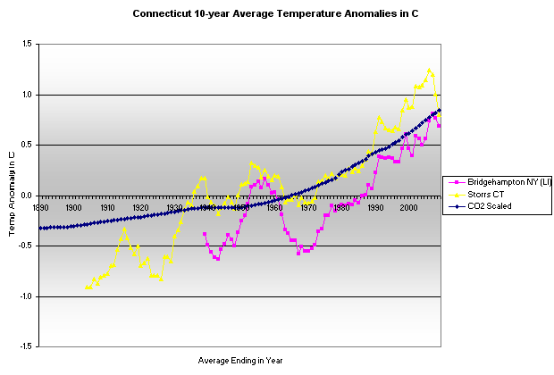
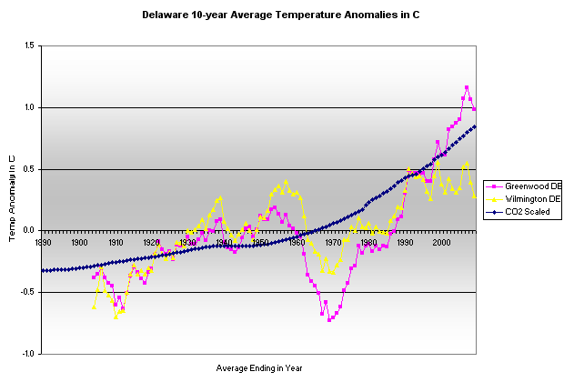
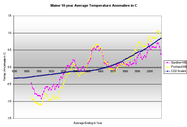
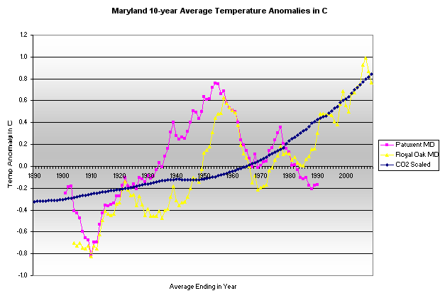
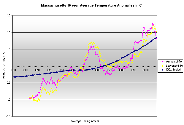
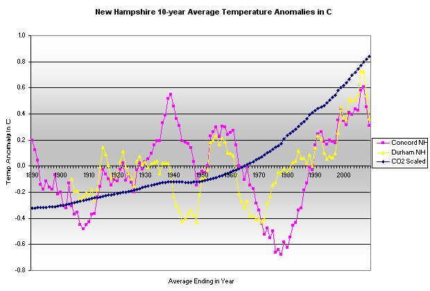
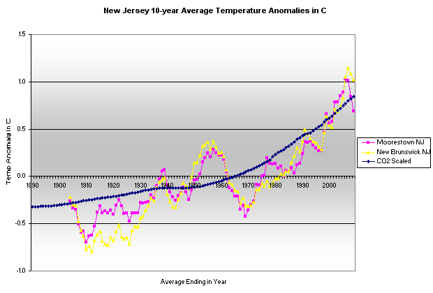
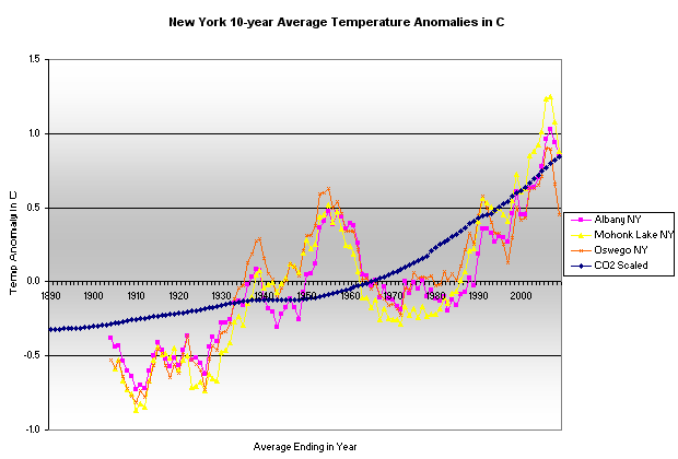
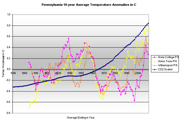
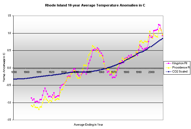
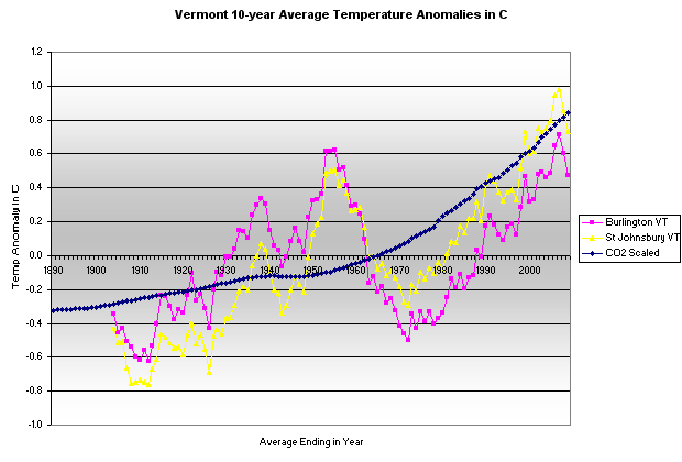
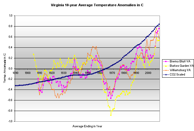
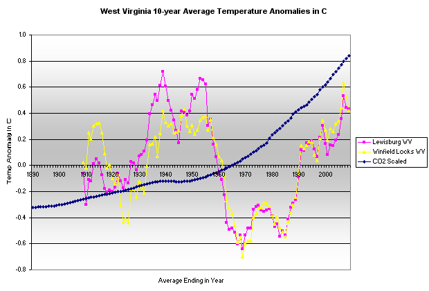
Locations across the Northeast region and the United States exhibit similar warming and cooling trends across the past century.
The day before I put this page on the site in 2010 (the analysis had been done in the previous days), a study was released that identifies the presence of the urban heat island effect in the temperature record. Several of the locations above were noted in that study (link broken to site: science and public policy)
perhaps the temperature data will be changed soon,
created - Feb. 2010
last change - 04/11/2010
Here is the list of topics in this AGW Topic Group .
All Topic Groups are available by selecting More TG.
All topics in the site are in the Site Map, where each Topic Group has its topics indented below it.
Ctrl + for zoom in; Ctrl - for zoom out ; Ctrl 0 for no zoom;
triple-tap for zoom to fit; pinch for zoom change; pinched for no zoom