Culture and Religion
A world view where the guide for society is based on human nature,
not on ancient scriptures. Home or Topic Groups
Local Temperature Trends do not Conform with AGW
The discussion about Anthropogenic Global Warming (AGW), or the theory that atmospheric gases generated by mankind are causing global temperatures to rise, is becoming rather uncivil. Many proponents of AGW deny that any criticism of the theory is valid while critics of AGW are labeled as 'deniers' of 'settled science' so rarely is there a civil debate of the situation. The AGW proponents predict many global catastrophes due to the warming temperatures caused by more CO2 (carbon dioxide) including melting ice caps, rising sea level, and various negative impacts on the plant and animal life on Earth. The AGW proponents are strongly pushing for severe reductions on CO2 emissions by industry, which will have accompanying impacts on the world's future economic health. If this prediction for future disaster has no scientific foundation (i.e., man-made CO2 is not causing global warming) then the impacts on people and industry will have been unnecessary.
After seeing a recent YouTube video about how analysis of NASA GISS temperature data can be done, I did my own analysis of local data.
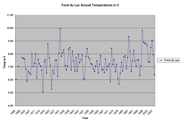
Here is a graph of the annual temperatures in Fond du Lac, Wisconsin, since 1895. GISS has some missing records at the start of the data base. GISS has the temperature data in Celsius.
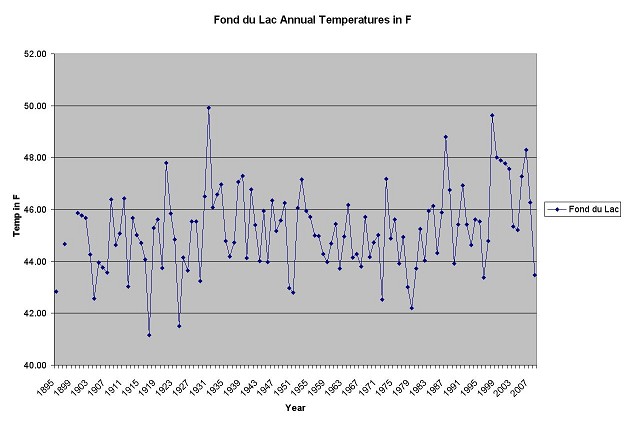
Here is the same graph but in Fahrenheit.
The data is fairly flat over the 110+ years. 1917 is the coldest year while 1931 is the warmest year.
Since 1900, the temperature trend in Fond du Lac has been 0.0088 C per year (110 years). Since 1910 (100 years), the temperature trend in Fond du Lac has been 0.0086 C per year or 0.86 C per century. Since 2000 (the span of the last 10 years is of course a small data set), the trend is -0.17 C per year.
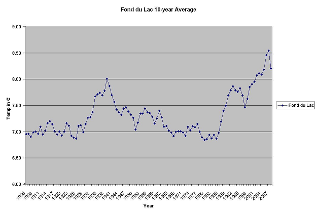
By using a 10-year average, the jagged graph becomes easier to read. The first warm peak is in 1940, the average of the 10-year span of 1931-1940. Here are the 10-year averages in Celsius.
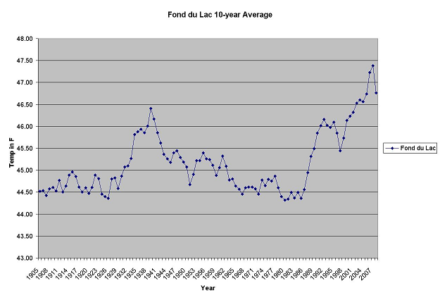
Here are the 10-year averages in Fahrenheit.
With this presentation, the early years are fairly flat until the warming that peaked in 1940. The following years cooled until the late 1980's. The recent years have been warming until the last year, 2008, that noticeably broke the trend by cooling.
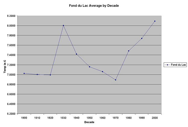
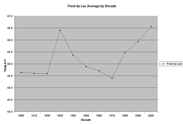
Another way to look at the temperature trends is by decade. The following chart plots the average temperature by decade.
As in the previous graphs, the early decades were cool, the 1930 decade (the average temperature in 1930-1939) was warmer, followed by several cooler decades. Recent decades have been warming since that earlier cool span.
These trends in the temperature records do not align with the expectations of the AGW theory, where the increasing levels of CO2 during the 20th Century did not result in consistently warmer temperatures. In fact, there is a significantly warmer decade (the 1930's) that is followed by several cooler decades while CO2 was increasing. This observation alone should falsify the AGW theory.
There have been suggestions that the temperature record has been tampered with (including recent (late 2009) revelations that have become known as ClimateGate), to help make the case that global warming is much worse than might be expected from natural variations. The following chart shows the differences between the GISS 'raw' temperature record and the 'homogenized' temperature record.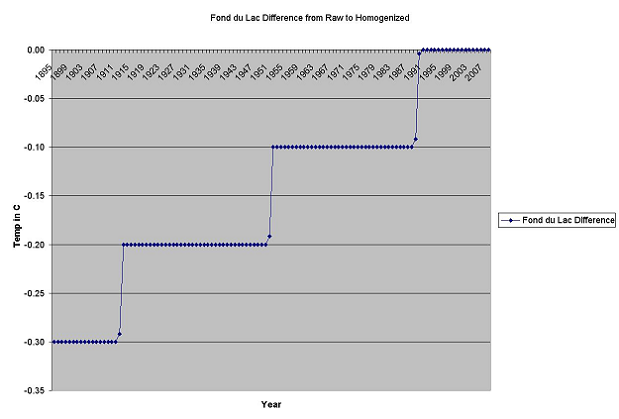
There is a definite pattern to the differences between the annual temperatures calculated from the raw data set and the homogenized data set. The oldest records in the homogenized data set have an annual temperature from the raw data set reduced by 0.3 C, until 1912. The following years, until 1951, have an annual temperature reduced by 0.2 C. Then the years from 1952 through 1989 are reduced by 0.1 C. Years since 1990 have no difference in annual temperatures.
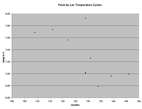
David Archibald has a number of presentations available including from his web site, www.DavidArchibald.info. He has proposed a connection where the length of a solar sun spot cycle affects the earth's temperatures, with shorter cycles causing warmer temperatures or longer cycles causing cooler temperatures. The following chart plots the relationship of the solar sun spot cycle lengths and the Fond du Lac temperatures in the raw data set. The temperature values are averages over the 11-year span centered on the solar cycle maximum.
There is a rough relationship observed in the plot with the shorter cycles nearer the upper left (warmer) and the longer cycles nearer the lower right (cooler). However there are several cycles off the theorized linear relationship, including one in the middle at the top which is the solar cycle 23 with the unusually warm year of 1998. The history of temperatures in Fond du Lac is barely over 100 years (with only 10 points) so the data set is less than for those locations in Europe used in the web presentations.
The above charts and observations involved the temperature history for only one location, Fond du Lac, Wisconsin. A similar analysis was also conducted for a larger collection, including other locations in Southeast Wisconsin and Northeast Illinois. This analysis included:
Fond du Lac, Wisconsin
Oshkosh, Wisconsin
Green Bay, Wisconsin
Milwaukee Mt Mary, Wisconsin
Racine, Wisconsin
Aurora, Illinois
Midway, Illinois
The power point can be downloaded from this link: TemperatureAnalysis.ppt (about 1.2MB). The distance from Green Bay to Aurora is about 188 miles (303 km).
Similar warming and cooling trends over the past century are noted across this wider geographical area. A similar rough relationship between the length of solar sun spot cycles and the average temperature is also observed.
The various Excel spreadsheets for this web page or the power point can be obtained from the author.
After this analysis was completed, an analysis of national temperatures was performed with similar results.
created - Dec. 2009
last change - 01/02/2010
Here is the list of topics in this AGW Topic Group .
All Topic Groups are available by selecting More TG.
All topics in the site are in the Site Map, where each Topic Group has its topics indented below it.
Ctrl + for zoom in; Ctrl - for zoom out ; Ctrl 0 for no zoom;
triple-tap for zoom to fit; pinch for zoom change; pinched for no zoom
